
This article was originally published on September 21, 2023, and then updated on May 8, 2024 to reflect the latest information.
Today, the iconic WNBA Logo is widely recognizable: A woman athlete dawning a discernible bun, mid-jump and extending upward for a left-handed layup.
For those who love the W, that memorable bright orange athlete exudes a feeling of freedom and empowerment.
But, is the WNBA logo player based on someone real? If so, who is the athlete supposed to be? Who is the WNBA Logo?
The WNBA has undergone two significant rebrands, one in 2013 and another in 2019. And with each came a refreshed logo meant to reflect the evolving league and its players.
Here we discuss the story behind the WNBA logo player. We explore its original and updated designs, and finally shed light on what player serves as the basis for its recognizable emblem.
The WNBA Logo Is Based On…
The question of “Who is the WNBA logo?” has stirred debate among fans since the updated WNBA logo was introduced in 2019.
In a unique twist, the WNBA claims the logo doesn’t draw inspiration from any single player or even a group of specific players.
That’s right– The WNBA logo is not based on anybody.
At least, that’s what league officials say. When the latest orange woman logo was unveiled by the WNBA in 2019, fans wanted to know who was the basis for the silhouette. But according to the league and the brand design agency that created the design, it’s nobody.
The design agency claims they were going after a more modern and streamlined look. So, they set out to come up with a more athletic, dynamic, and free player. With this in mind and using input from players, they crafted the logo from hundreds of sketches. But no single player was on their minds.
But hold on, that’s not the end of it. There’s more…
Learn more: Who is the NBA logo?
Debating Who the WNBA Logo Is
Despite claiming the logo isn’t based on any player, the league (at least its social media team) used the fan interest to stir the pot and suggest otherwise.
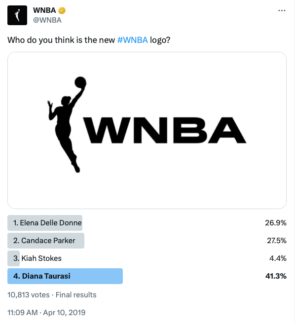
In an April 10, 2019 Twitter poll, the league asked fans to speculate and vote on who they believed was the new WNBA logo player. Fans were given four players to choose from:
- Elena Delle Donne
- Candace Parker
- Kiah Stokes, and
- Diana Taurasi
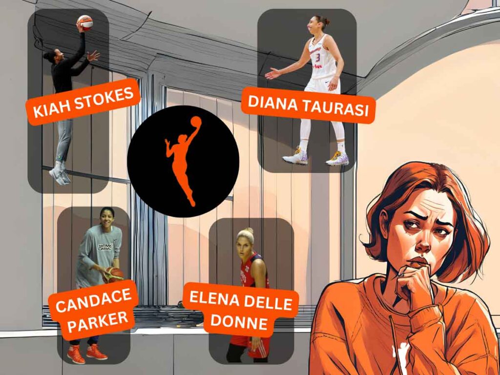
Elena Delle Donne and Candace Parker garnered a significant share of the votes, with 26.9% and 27.5%, respectively. Kiah Stokes earned 4.4% of the vote. However, the indomitable Diana Taurasi emerged as the likely inspiration, securing a commanding 41.3% of the votes.
In a 2019 panel interview with The Undefeated, Sue Bird and Kia Nurse shared their thoughts on who the logo could be.
“The WNBA put out four options of who it could be on Twitter,” said Kia Nurse. “I was going through them, and one of them is my teammate [Kiah Stokes]. I’m like, ‘That’s not her.’ Then I said, ‘OK, she has a bun. …’ So it’s either Diana Taurasi or Elena Delle Donne.”
“The bun could be Diana,” said Sue Bird. “The actual movement, I’ve heard people say Kiah Stokes. Who knows? They’d never admit it was somebody anyway, so it won’t matter.”
With her long, dominating career and a distinctive bun resembling the WNBA logo player, Diana has an unmistakable presence that fits the bill.
The Shortest WNBA Players: Right Now and All-Time (Updated 2024)
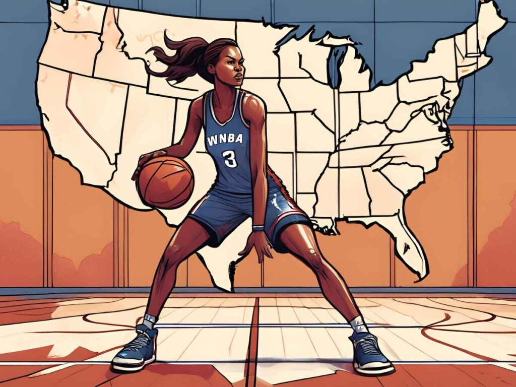
Explore the W: Map and Count of WNBA Teams Across the States
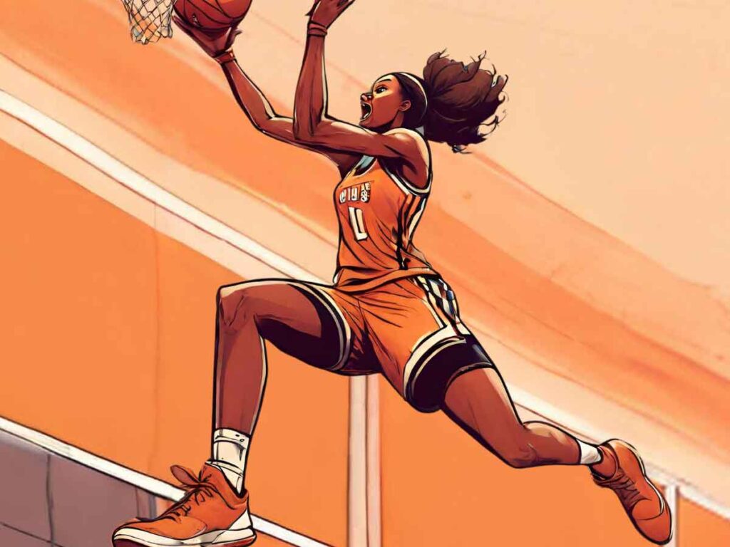
WNBA Dunks: The Complete History with Visual Breakdowns
WNBA Logo Design
You can thank branding agency Sylvain Labs for today’s iconic orange WNBA logo. According to the agency, it’s mean to represent more than the league’s brand identity; it also exemplifies empowerment, diversity, and the relentless spirit of the players who make up the league.

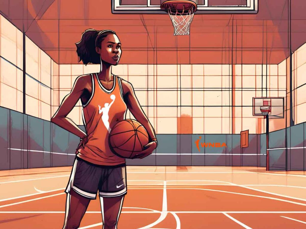
The logo features the silhouette of a strikingly orange athlete depicted in mid-jump with an outstretched arm and basketball, exuding confidence.
One of the standout features of the WNBA logo player is the athlete’s bun hairstyle. This design element pays homage to the way many players wear their hair. But it also whips up debate around the WNBA logo player.
The current WNBA logo also breaks from the conventional confines of a rectangular frame that you see in the logo of its NBA counterpart and other leagues. Liberating the player from the box-like structure is meant to suggest the athlete now moves encumbered with freedom — as if saying, “basketball on our terms.”
With this design, the WNBA believes it better targets its growing audience, millennials aged 16 to 34. The logo’s modern feel and cultural relevance align with the diverse and socially-conscious fan base.
History of the WNBA Logo
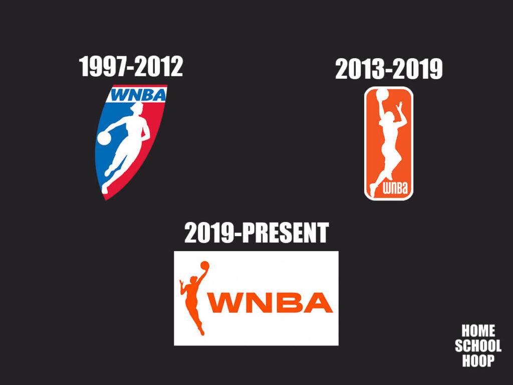
Since its inception in 1996, the WNBA’s visual identity has undergone a transformative journey. This journey involved the original logo followed by two major rebrands.
Each logo iteration served as a visual representation of the league’s evolving identity. The league has changed significantly since its beginning, and every branding upgrade reflected those shifts.
1997-2012 (Original WNBA Logo)
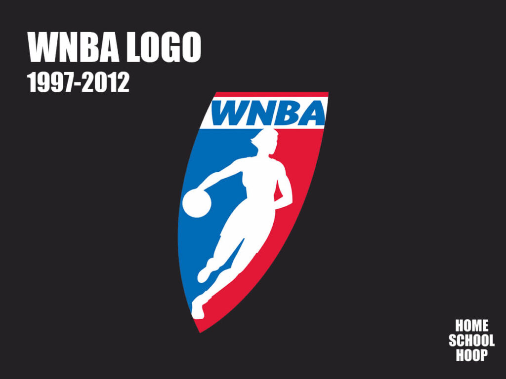
Let’s start from the beginning. The original WNBA logo, used from 1997 to 2012, featured a distinctive tilted shield inspired by the Jerry West-inspired NBA emblem. This shield evoked a sense of tradition and conveyed movement and speed through its slanted shape.

Like with the NBA’s logo, the WNBA emblem was a nod to the American flag with its red, blue, and white color scheme. But, the defining characteristic of the logo was the silhouette of a woman basketball player at its center.
If you look closely at that original WNBA logo player, however, you can tell that it’s an unusual body shape and not based on any particular player.
2013-2019
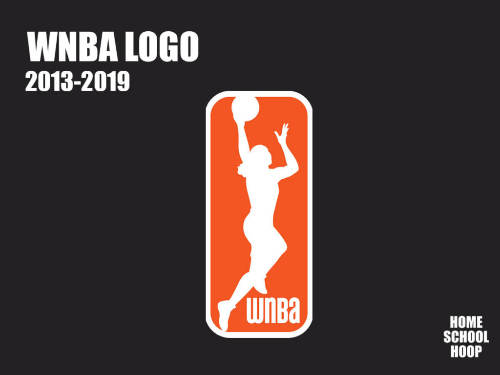
Out with the old, in with the new. In 2013, the WNBA embarked on a rebranding journey that significantly departed from its previous logo.
The league retained its focus on portraying a player in action, but it moved away from its earlier NBA-inspired look. It got rid of the familiar red, blue, and white color palette and introduced the striking combination of orange and oatmeal. This echoes the pattern of the league’s distinctive game balls.

This fresh color scheme infused the logo with simplicity but also power. At the same time, the logo transitioned from the original shield shape to a vertical rectangle. This symbolized a shift toward a more contemporary look.
The ponytailed player silhouette, previously seen dribbling, now aggressively attacked the basket. This better reflected WNBA players, who are athletic, agile, and competitive.
And, ahem! While the league never officially confirmed a specific player as the inspiration for this design, Sue Bird’s name frequently surfaced in discussions.

2020-Today (Current WNBA Logo)
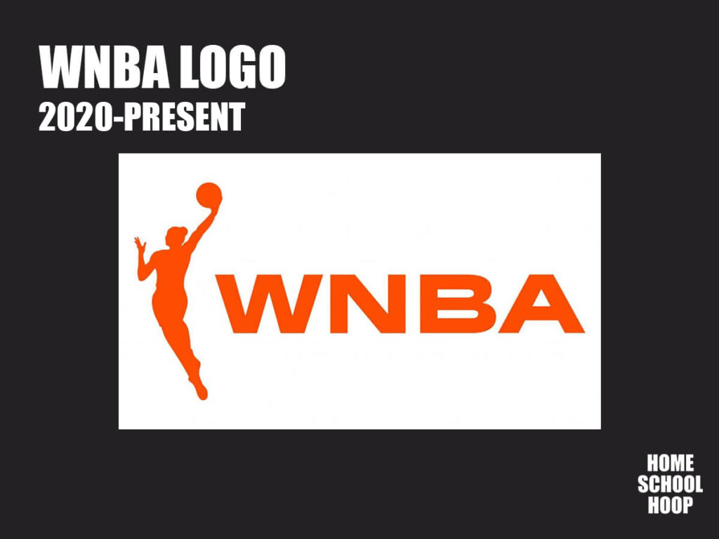
The current logo, introduced in 2019 and used since the 2020 season, was once again a major departure from its predecessors. This time, the designers mirrored the player’s silhouette, rendering it in vibrant orange, and elevated it as the primary emblem.
Alongside this iconic image was a wordmark featuring the league’s acronym, presented in bold, wide sans-serif letters. Again, all rendered in orange.
This evolution in logo design was part of the WNBA’s ongoing commitment to engage with a younger, socially-conscious millennial audience.
Does it look like any WNBA player to you?
Impact of the WNBA Logo
Regardless of who the WNBA logo is based on, it’s since become a powerful representation of the league’s identity. Today, the logo is a beacon, drawing attention to the league and solidifying its presence in the pro sports world.
For example, the now well-recognized bright orange-and-white WNBA hoodie is now the league’s defining symbol. The classic orange WNBA sweatshirt is now one of the most iconic sports merchandise pieces, and even comes in an updated cropped version.
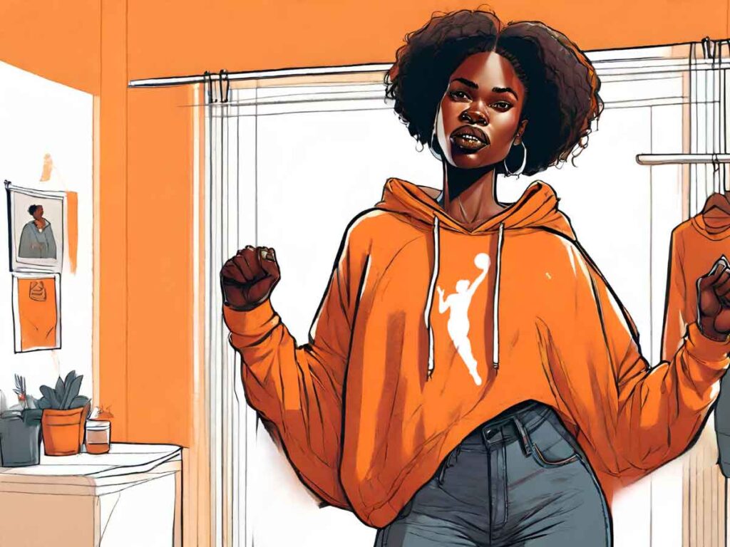
NBA greats like LeBron James, Damian Lillard, and Chris Paul wore the hoodie while in the Bubble in 2020 to show support for the WNBA and its players. Kobe Bryant sported it courtside a year earlier while taking in a Los Angeles Lakers game with his daughter.
The logo’s distinctive orange color and dynamic player silhouette does a great job of helping the WNBA to stand out. It’s instantly recognizable to fans and newcomers, and has been pivotal in building the league’s popularity to what it is today.
More on the WNBA
Want more WNBA content? Learn more trivia and history about the WNBA and its players, including WNBA quotes, by visiting our guide to the WNBA.